

Umass Medical School

CONSTRUCTING EXCITEMENT
An innovative new building was only an architect’s sketch at the point UMass Medical School called Idea Agency to create an identity for this landmark project that would “pioneer a new era of biomedical research, medical education, and campus collaboration.”
An evolution unlike any other
We quickly understood that this state-of-the-art building – involving thousands of people, millions of dollars, and multiple years – would be home to Nobel Prize-winning research and the future of life sciences. Named after the former Vice Chancellor of University Relations, Albert Sherman, we branded the building and the entire construction project with an eye toward a bigger, all-encompassing brand we soon referred to as The Life Sciences Evolution.
Here* is where we start
First, we created a strong visual identity – a logo that graphically represented an aerial view of the UMass campus in Worcester, placing an asterisk right where the new building would go. This visual mnemonic was used to denote both the actual location of the building as well as the concept that the Life Sciences Evolution was happening right here at UMass. The asterisk would go on to be used throughout the course of the project and beyond.
Building consistency across all mediums
Once the identity was established, we created a vision piece for donors and a microsite for posting critical information and updates during the construction of the Albert Sherman Center. Using architectural renderings, we began painting a picture of the new building, and creating construction signage and informational brochures. Finally, as the building was ready to be revealed, we took fresh interior photography for our special edition of the campus magazine, and designed event invitations and announcement signage to be posted on light poles on the streets surrounding the campus.
Success over multiple years
About our partnership with UMass for this project, Vice Chancellor for Communications, Mark Shelton noted: “Knowing the Sherman Center communications project would require a commitment over a period of years, we wanted the depth and breadth that comes from an agency that really takes the time to understand the goals and aspirations of a communications campaign… So as we expected, they not only had good ideas for us in abundance, but they helped us communicate thematically in support of the communications goals we set out to fulfill.”

MassMEP

MODERNIZING A BRAND TO REFLECT A CHANGING INDUSTRY
When MassMEP wanted to update their image to better match the advanced manufacturers they served, they turned to Idea Agency to put the wheels in motion.
Not your grandfather’s manufacturing
MassMEP (Manufacturing Extension Partnership) is a resource for the advanced manufacturing industry in Massachusetts. An outdated image, complex messaging, and dated communications materials didn’t reflect the next-generation manufacturers they were servicing. We brought them through our PURPLE process for brand development to uncover their true essence and position themselves for greater success.
Brand essence, brand appeal, brand architecture
We interviewed senior management to understand MassMEP at its core; we surveyed clients to uncover which services they valued most; and we helped the company restructure from five divisions acting as silos to three consolidated divisions that neatly dovetailed together. Ensuring that management’s vision and the new positioning of their offerings aligned with the audiences’ needs was an important first step in reimagining their brand.
Manufacturing greatness
With a new logo that illustrates many pieces coming together into one solid shape, we put forth the idea that MassMEP helps bring everything together for its clients. This new icon was accompanied by the tagline we created: “Manufacturing Greatness.” To round out the brand architecture, we created a logo, tagline, and messaging platform for each of the three divisions, which directed the creative development. We rolled out many communications pieces from a website, annual report, and sales collateral to an internal brand manifesto and corporate guidelines. All social media assets were also rebranded in the new look.
An elevated image
An early interview with President Jack Healy revealed that his dream was to position MassMEP as a resource and build a community of information sharing among Massachusetts manufacturers. “We all have something to learn from each other,” he said. The clarified brand, simplified messaging, and streamlined offerings deliver on that promise. MassMEP’s enhanced image keeps them at the forefront of an expanding industry as the voice and advocates for all Massachusetts Manufacturers.

Zoots Dry Cleaning
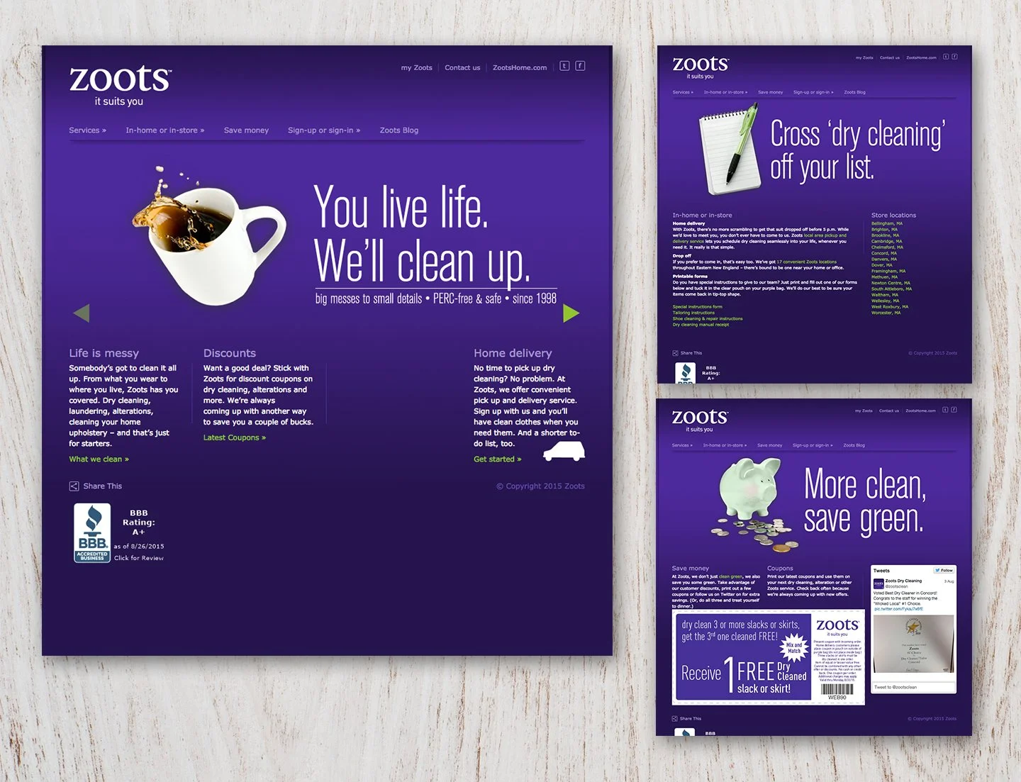
BRAND IS MORE THAN A LOGO, TAGLINE, OR WEBSITE
Zoots Dry Cleaning came to Idea Agency for a new website. What they got was a refreshed brand position and a much better understanding of their audience.
Understanding attitudes creates connections
Kicking off with quantitative audience research that segmented Zoots’ customers by attitude, we were able to understand their motivations behind choosing a dry cleaner. With this information, we created umbrella messaging that would appeal to all segments and, then, launch a targeted campaign and media buy focused on the two segments that had the most impact on revenue.
Unique perspectives require custom messaging
Two very distinct audiences – customers who relied heavily on an in-store experience (“Out and Abouts”) versus those who preferred to do as much as possible without setting foot in a store (“Remote Access”) – needed very different messages. With that in mind, we ensured messaging on the website addressed both perspectives, media placements reached them in their own unique places on the web, and email newsletters spoke specifically to supplemental services they would be interested in.
Boosts for Zoots
Not only did Zoots experience an overall boost in revenue for the year, they saw a 10% increase in new customer signups. Personalized messages resulted in higher click-through rates on their email blast, increased visits to their blog, and, most notably, a 7% increase in alteration sales due to highlighting this area of importance to the audience.

Ahearn Equipment

SHIFTING STRATEGY FOR GROWTH
Ahearn Equipment engaged Idea Agency to help them capitalize on a new area of growth for the company by understanding and attracting the right type of customer.
Taking a big-picture perspective
Feeling like their previous agency wasn’t taking a strategic approach to marketing, Ahearn Equipment engaged Idea Agency to help evaluate their marketing efforts, and ultimately, reposition the company to better align with Ahearn’s business goals.
Branding from the inside-out
Through our PURPLE process, we helped this well-known and trusted family dealership capitalize on their strengths and appeal to their range of audiences: from contractors to homeowners. With an inclusive position of treating their customers like family, we developed the “Get Dirty with Us” campaign that manifested first internally at a special launch event as t-shirts, brand guidelines, an employee manifesto, and pocket-sized core values cards.
A strategic approach to marketing
With a primary objective of increasing sales of heavy equipment to contractors – a key growth area identified by Ahearn – we conducted a motivational research study that provided important insights about contractor attitudes. Armed with invaluable information that ranged from motivations to media consumption, we developed a LinkageTM marketing plan that included everything from in-store collateral to direct mail postcards and radio advertising with messaging that resonated with key audiences.
Success realized
After implementing this rebrand, Ahearn Equipment saw a nearly 50% increase in revenue over the previous year; sales of heavy equipment grew to become nearly 30% of the business when it was previously under 10%: reflecting an increase of roughly 400%.

NBCU

KEEPING IT REAL
New Bedford Credit Union was eager to update their dated image and turned to Idea Agency to create a new brand that reflected their expanding footprint, appealed to the regions younger population and increased their membership base.
Discovering the truth
Gathering the organization’s key leadership team, Idea Agency conducted WHY interviews and lead vision workshops that uncovered the good, and the not-so-good too. Importantly, the robust discovery successfully built consensus and aligned brand goals. The Credit Union’s storied history, community perception, and current employee culture proved to be very telling. Simply put, we discovered that New Bedford Credit Union’s new brand direction would be as straightforward and relatable as its 86-year-old reputation.
Say it like it is
The new brand direction positions the Credit Union as the financial institution who always has your back, and understands their member’s needs and the community they serve, promising to deliver no-nonsense banking, no-fuss service, and no hidden language. NBCU is committed to providing members the comfort and confidence in knowing that they are always in their corner.

Venture Community Services
A PATHWAY TO SUCCESS
The name Rehabilitative Resources, Inc. (RRI) no longer told the whole story behind this 40-year-old organization, which serves adults with developmental disabilities, their families, and the community. The company turned to Idea Agency to help increase awareness with a fresh position in the marketplace.
Looking to the future
Celebrating its 40th anniversary with a new CEO at the helm, the right time was right to review RRI’s position in the marketplace, and their name that no longer described their service offerings. “RRI is not about rehabilitation,” Christine Tieri, President of Idea Agency stated. “They are dedicated to helping those with disabilities and their families lead lives the way that makes the individual and family most comfortable.” RRI wanted to leave no stone unturned and rebrand themselves to reflect what they do today and what they plan to do in the future.
A transformation from the inside out
Using our PURPLE process, we started with an executive team workshop to uncover core values, strengths, weaknesses, opportunities, and attributes. We engaged them in spirited discussion, teased through challenges, envisioned the future, and laid the foundation for a new position – one that was born out of the very people who live and breathe their brand every day.
New name, new face, new voice…new brand
From a variety of new names presented by Idea Agency, the client selected Venture Community Services. Venture speaks to the journey each individual is on and the support provided – through many different services – by the organization. We positioned Venture in the marketplace as “offering a visionary approach that empowers families and individuals to reach their goals,” and created the tagline: Pathways to Empowerment. This new name, tag line and position was embraced by the entire organization. Internally, everyone rallied behind their new name and look, and externally, they had a more compelling – and accurate – story to tell.
In order to bring each of their more than 600 employees on board, we created a brand manifesto that explained the name change and described the meaning behind the new brand. We developed corporate identity guidelines and a messaging platform to ensure the brand was consistent throughout various communications which included a new website and support materials for a big launch Gala where Venture unveiled their new name and position to the public. The organization quickly adopted their new brand into their facilities, onto their vans, at public events and beyond.
Exactly where they want to be
The client considers their transformation a huge success. CEO, Mike Hyland, states that the rebranding process with Idea Agency “created a great deal of energy and conversation that never happened before. All of a sudden people felt like they were reinvesting in their own employer. It was a critical means – as we went through more changes – to keep people grounded. In addition to this energy, it’s created investment in what we do, not just internally but also externally. People are interested in finding out more about us.”

edHealth Brand Development
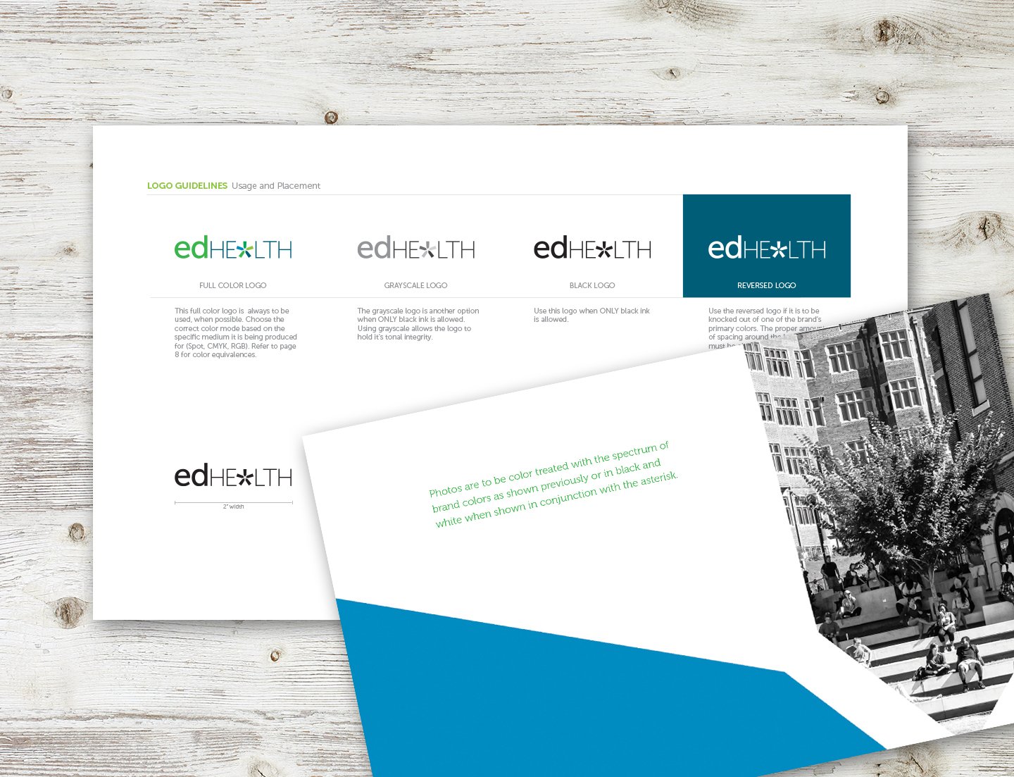
GRADUATING TO THE NEXT LEVEL WITH A NEW BRAND
edHEALTH, a recently formed consortium of educational institutions, knew they had a good thing going. But to increase their membership, they were going to have to put a face on their organization.
Building on a healthy start
edHealth provides innovative initiatives specifically to educational institutions so that they can offer quality healthcare while controlling costs. With a strong launch of over one dozen member institutions, edHEALTH was ready to move the organization to the next level.
In order to build up the roster with other New England educational institutions, as well as keep an eye towards eventually expanding to a national audience, they hired Idea Agency to develop a new, professional brand. edHEALTH turned to Idea Agency – a New England firm with expertise in brand development and integrated marketing – to help move them to the next crucial phase. Utilizing their PURPLE® process for brand development, Idea Agency invited edHEALTH to their offices in Sturbridge, MA to partake in a daylong workshop to help discover the best position for edHEALTH in the marketplace.
Better together
As part of the Idea Agency’s Purple® process for brand development, members of edHealth came to Purpletopia – the agency’s brainstorm facility – to partake in a daylong workshop. During the event, the participants worked collaboratively to understand their SWOT, hone their vision for the future, and identify their brand distinctions.
Creating a brand from the inside out
With a focus on innovation, transparency, member ownership, and simplifying the complex world of healthcare insurance, the agency first helped edHEALTH put its stake in the ground with a new image. We developed a visual identity system including a logo, brand guidelines, and corporate identity package. From there, we created a messaging platform including tagline, umbrella theme, and niche messaging to address their variety of audiences. Finally, a comprehensive website with member portal, sales materials, and other communications materials followed.
From complex to commanding
Through the thoughtful Purple® process, Idea Agency was able to take a complex concept (self-insurance), a complex organization (an organization owned by multiple institutions), and a complex message (cost-savings through collaboration), and simplify it into one powerful message that commands attention.

Thrive Support & Advocacy

Case Study
Greater Marlboro Programs, Inc. was ready for change. The dated name and look didn’t reflect the amazing things this organization is all about. So they hired Idea Agency to create a new name, voice and face on this thriving organization.
Don’t worry about sounding professional. Sound like you. There are over 1.5 billion websites out there, but your story is what’s going to separate this one from the rest. If you read the words back and don’t hear your own voice in your head, that’s a good sign you still have more work to do.
Be clear, be confident and don’t overthink it. The beauty of your story is that it’s going to continue to evolve and your site can evolve with it. Your goal should be to make it feel right for right now. Later will take care of itself. It always does.
Redefining the organization
After 40 years without an update to the brand, this social services organization appeared outdated and tired. This is an organization committed to redefining disabilities by focusing on abilities for the youth, adults and families that they serve. With a new CEO in place, they turned to Idea Agency to help define a new brand position that better reflected who they are at their core.
Change from within
We took the organization through our PURPLE process for brand development, including collaboration from members of the board, leadership, residence managers and others. With perspective from all sides, we dug deep to truly understand the DNA of this inspiring organization which would manifest itself in the form of a new name, brand identity, video, website and communications materials.
Unanimous approval
We crafted their new brand promise, which led to unanimous approval of their new name: Thrive. “With a singular focus on creating experiences that meet the needs of their clients, only Thrive offers the unparalleled programs, commitment and support that helps create lives filled with happiness and pride.”
Beyond the brand foundational pieces, we helped Thrive hone their unique process which focuses on cultivating the abilities of each individual in what they now call the iPlan. To further round out their brand, they also implemented a leadership program under the new Thrive brand called LEAD, Leadership, Experience And Development, which supports and encourages young leaders with developmental challenges to raise awareness and be a bigger part of the community.